10 common misconceptions about architecture practice websites
This week I’m focussing on websites, because I think they are one of the least well understood marketing channels in the architects’ playbook, yet they represent the foundation of all your marketing activities.
Did you know that all of your marketing activities – across social media, referrals, awards, publication, and email marketing – should use Calls to Action to drive traffic to your website, so you can invite visitors to start (or continue!) a dialogue with your practice?
Unfortunately, that’s not the purpose of most architecture practice websites. Instead, I see architects creating websites based on these misconceptions:
1. New clients will magically find you. But they won’t if your website is a catalogue of words and pictures that pays no mind to SEO (search engine optimisation).
(This issue is rife. I’ve seen architecture practices launch brand-spanking new websites with magnificent images and great copy, but no SEO-driven H1 and H2 headers, titles or meta data descriptions. So what, you say? Well if Google doesn’t know what your web pages are about, it can’t classify your content, and it won’t serve up your website in search results. Ever felt invisible? This is probably why!)
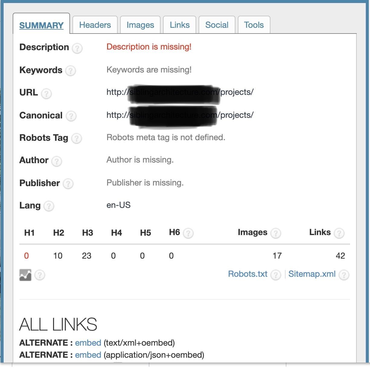
This architecture practice website is missing key metadata fields that Google uses to categorise for search.
It’s also missing H1 headers - Google’s favourites - and the H2 and H3 headers aren’t search-friendly.
2. New website visitors will convert into new clients in a heartbeat. The online landscape has changed dramatically since the introduction of social media, and the days of websites acting as a digital business card are long gone.
(Now you need to build trust and engagement on socials and your website, and it’s hard to do that if you only feature images of completed projects accompanied by text that appeals to your architectural peers. Instead, use projects to describe and illustrate how you create value and solve problems for your clients.)
YOur website needs to clearly state what you do, who you serve, and why your offer stands out from the crowd.
Photography by Ben Kolde via Unsplash.
3. A website is all about your practice. It’s not. It’s about your customers and what you offer them.
(So all those tricky, design-y websites – the ones that take ages to load and attempt to wow visitors with fancy graphics but very little else - they don’t give the impression that you intimately understand your clients’ problems. Rather, you should ensure all of your website content is customer-centric and outward facing).
4. A website is a platform to display your recent projects. So it’s a mostly static entity that you update only when you have newly photographed projects to showcase.
(Very few architects use blogging – aka content marketing – which is useful for several reasons. It’s a great way for you to inform, educate and entertain your prospective customers about your process, approach and ideas. Also, uploading regular content to your website makes the Google bots crawl it regularly for new info. And blogging is the Number 1 way to increase your results in Google search rankings, because Google prioritises websites with content that is useful to visitors. And naturally Google knows a) how many people click on your search results, b) how many pages they look at when they visit, and c) how long they stay on your site. Do you know those stats about your own website??)
5. Your website serves as a beautiful portfolio of your best looking projects. But you fail to understand what your future ideal customers are searching for online.
(There are plenty of free tools that can help you work out the best search keywords that your ideal customers are likely to use when they’re searching for your type of service. But if your content includes none of those search terms, you’re not going to be found when customers go looking. Trust me.)
Google’s “Searches related to…” function is one of many free keyword tools you can use to find out what your customers are searching for online.
Websites need to build trust and engagement with your future clients and should convey your values and what you stand for. Photography by Proxyclick Visitor Management System via Unsplash.
6. A single hero image on the Home page will suffice. You’re a visual communicator so you don’t want words cluttering up your Home page, let alone a tagline.
(This can spell instant death to new visitors, because the average attention span is 8 seconds. In that blink of an eye, you have to explain what you do, who you do it for, and why you are better than your competitors. If you choose to do that using only images, you’re either a genius communicator or you’re destined to fail. If this sounds like your website, check your home page bounce rate from social media leads, and see if I’m right!)
7. Your website is an unresponsive concierge in your business. Unfortunately, being unresponsive, it fails to spark a conversation between visitors and your practice.
(Ideally, your website should reflect you, your values, your tone of voice and personality. Show your name and face. Describe your credentials and approach. Start a discussion with your visitors. Invite them into dialogue with your practice. People buy from people!)
8. It’s sufficient to put up an online shingle and let the work speak for itself. That may have worked in 1999. Or not. But in the 2020s, your website should be a high-performance sales tool that works hard even when you’ve switched off.
(It should impart useful insights and generously provide value. And it should most definitely capture contact details from your visitors, usually via a compelling lead magnet. Because how can you begin to convert website visitors into customers into clients into ambassadors, if you don’t have any way of conversing with them offline?)
9. New visitors will view your website on a big, easy-to-read desktop monitor. Do you know what proportion of your new visitors are using tablets or mobile devices? Is your website responsive to these?
(If your layout turns off phone and tablet visitors before they even get started, by extension, your social media efforts might be completely wasted… because most people scroll socials on mobiles and tablets.)
10. Your word carries sufficient weight to convince visitors to trust you and your offering. A whopping 90% of people trust peers on social networks - even strangers! – while only 15–18% trust brands.
(So let your satisfied customers do the talking on your website and social media, via testimonials that describe the value of your service offerings and the ways you delivered unexpected delight.)
So, what do you think of this list? Is your website failing you on any of these counts?
If it is, and you’re not sure how to overcome them, I offer three services to architects, ranging from two-hour Acupuncture Sessions to the three- month Review + Reset consulting package.
If you haven’t explored my six-channel system, you can get a feel for how it works via the free Marketing Metrics tracking spreadsheet – and a video that describes how to use it – here.
If you’d like a short, sharp injection of architecture-specific expertise – to talk about any business development or marketing issues you’re grappling with – you can book an Acupuncture Session here. You can choose the topics we discuss, and tap into my knowledge, experience and connections to access insights that are customised for your practice.
You can enrol in the self-guided online program - Architecture Marketing 360: a CPD course for architects - and get started straight away, here.
If you’re interested in my consulting package, you can find details about Review + Reset here. (I have a waitlist for new Review + Reset clients, and that’s what I aim to help you achieve for your architecture business, too).
Lastly, if you have any questions about this blog post, or any of my services, please click here to email me. I’m always happy to hear from architects who want to improve the way they communicate their value to future clients. offer three services to architects


